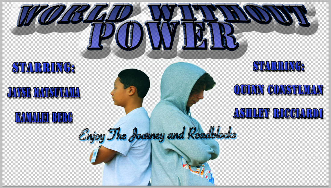
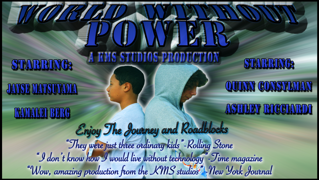
In our movie poster we have many different characters, but there is one main character that is the leader of the group that tries to turn the power back on. Also, we can't have an amazing movie poster with out the evil villain in it too, so on your left you will see the evil villain named Quinn. The characters are back to back ready to battle. The main person who really believes that they can do it is the one on the right (Kekoa). He really wants to turn the power back on, but he knows he can't do it himself so he has to get help from two best friends, Ashley and Kamalei. The characters are placed in the woods because that is where they meet in the movie trailer. And that is an explanation on the movie poster that I made in photo shop for our movie trailer on, "A World With No Techno".
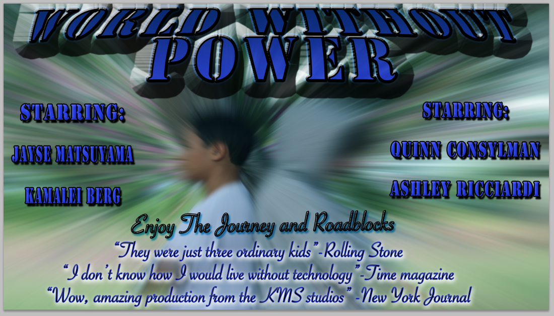
The title for my teams' movie trailer is, "A World With No Techno." We decided to name our movie trailer this because we really wanted to teach the audience to not take technology for granted and not "over-use" it. One day the technology might go out in some places for a while and if you rely on technology all the time you are not going to be able to be okay. Now, when I was making this amazing title I found out some of the different terms that are used to create things like this. One of the terms is called Kerning, the sizing and spacing between letters. We Kern because if you want a sentence to fit on one line you can Kern it so it looks better. Some other text we added into our movie trailer poster is the different magazines and other people that has seen our movie trailer, or movie. For example, Time magazine said, "I don't know how I would live with out technology as long as these kids did!" Also Rolling stone commented on our movie as well, they said, "They were just three ordinary kids."
I think that the overall impact on the layers and the different effects was pretty good. I think that the layers helped a lot to give it the "in the future" look. For example, the background effect on the image was pretty cool. It helped so that it looked like the people were popping off the page, or zooming into the future. Also, with the spread and outer glow on the text combined with the image popping off the page it really makes it stand out. Another effect that made this text stand out even more is the color. I put a gradient overlay on the text, so it faded from the darkest blue to a dark purple color. And those are some effects that I put on my movie trailer poster to make it pop out and look as cool as possible.
| 
|
 RSS Feed